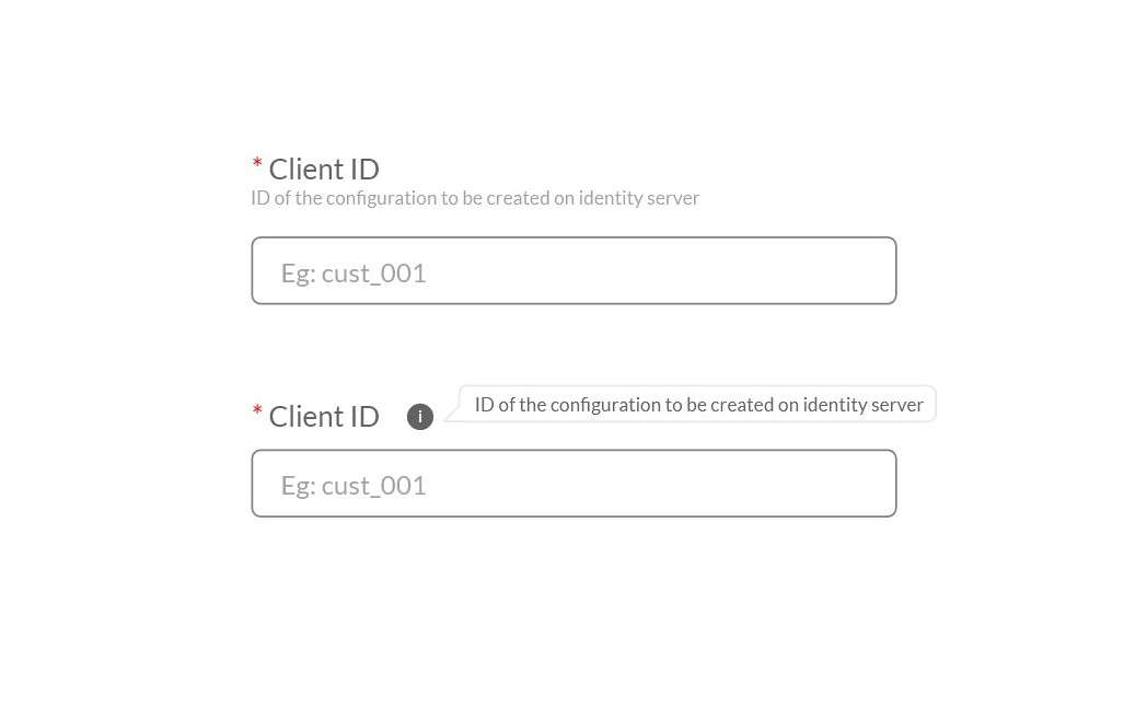
The tooltips in MainWP are more annoying than they are useful. They basically just repeat what the self explanatory setting is already saying:
How many users are hovering “Get help”, puzzled what it means.
Tooltip to the rescue “Need help”?
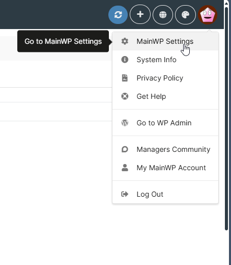
This is so unecessary. So are the rest in the example and 80% of those i see in the dashboard. (also wtf is that pink icon?)
Anyways, it is at the point where i have to disable them all, because this is just too annoying.
But apparently, i need CSS to do that?
Why do you not just create it as an option in settings, like most apps would do, and as most users would expect?
Would that not be a better experience?
Instead, the user is forced to:
- Search through settings for the option, which did not exist, so waste of time
- Google how to disable them
- Install and extension, just so to have the option to remove them
- Paste the code
Not a great experience. I honestly dont want to install that extension, because i dont need it for anything else.