Hello team,
I’ve been using MainWP from the beginnings and purchased the lifetime license right away and loving it. I’m using the dashboard on my phone 90%+ of the time as it’s with me all the time and can easily check out the latest updates and so on, but with the latest 2 releases 4.2.2 and 4.2.3 the dashboard is just unusable on mobile devices. I’ve already sent many replies on your Facebook posts on the group with feedback and screenshots but it seems that instead of actually fixing it we are going further with the same issues. Can you please please please get some feedback from actual users before doing an important change like this? I am now forced to return to the older version of the dashboard 4.2.1 because the newest responsive version is just making me lose time and do mistakes instead of improving the experience.
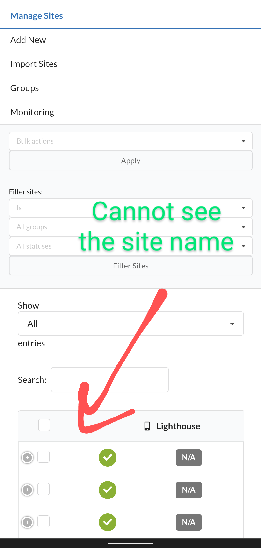
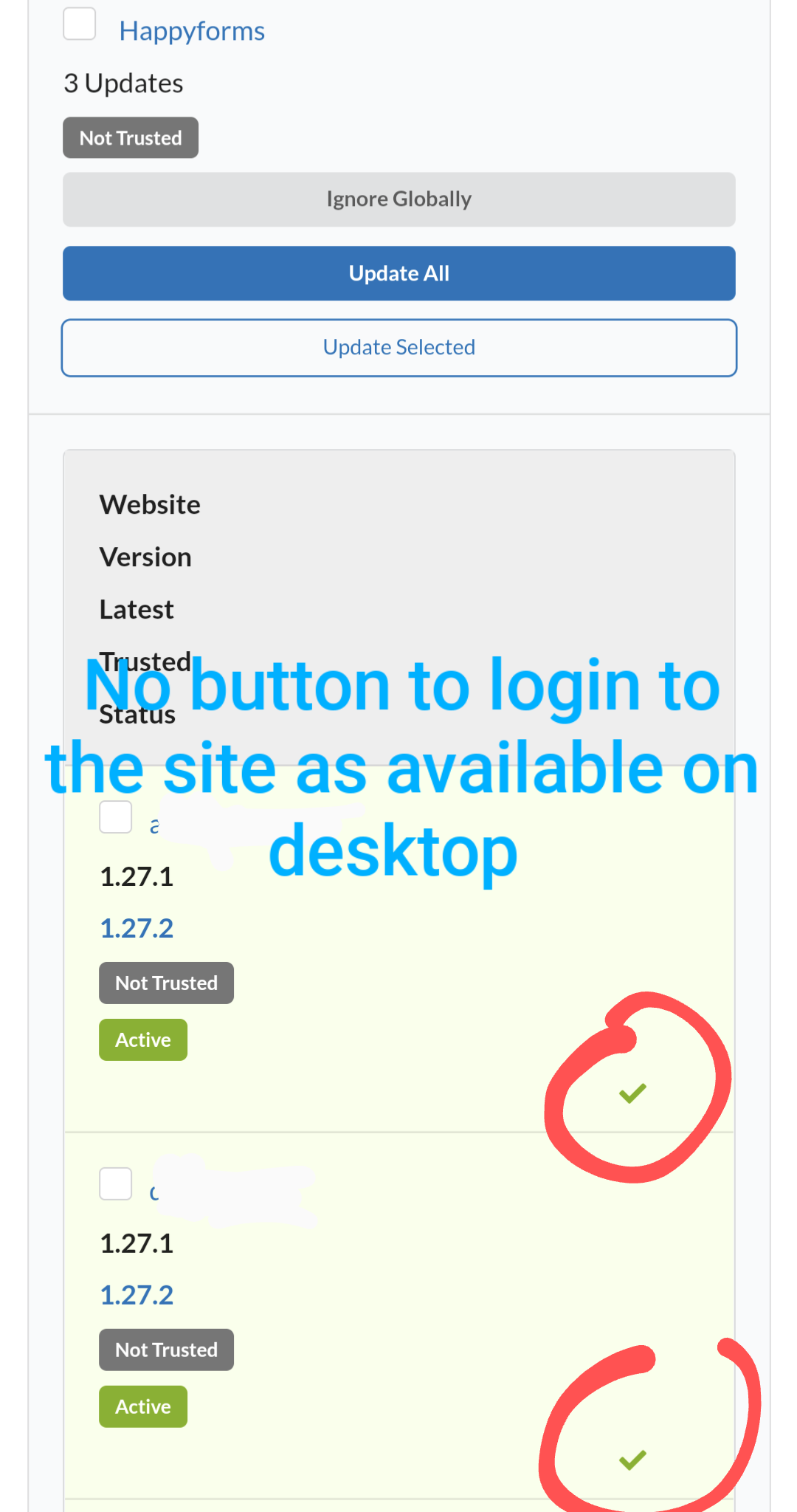
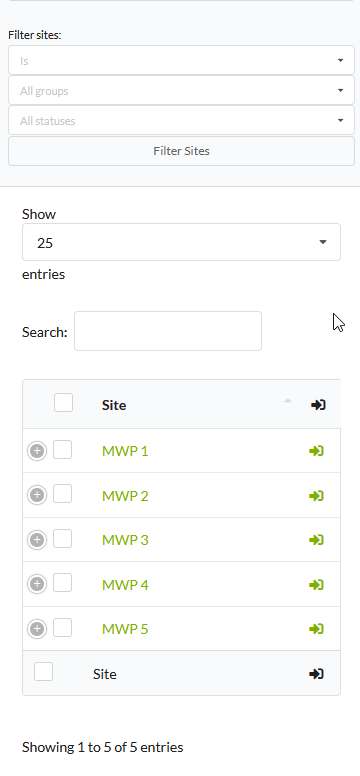
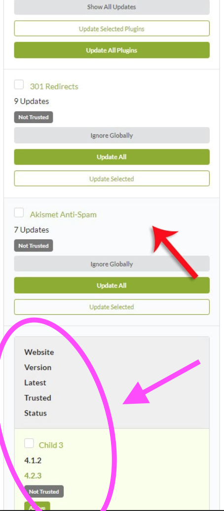
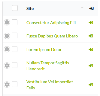
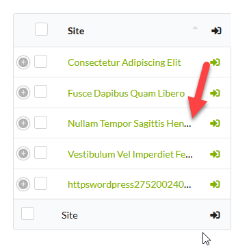
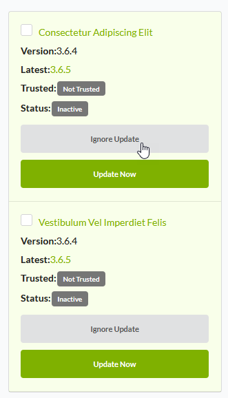
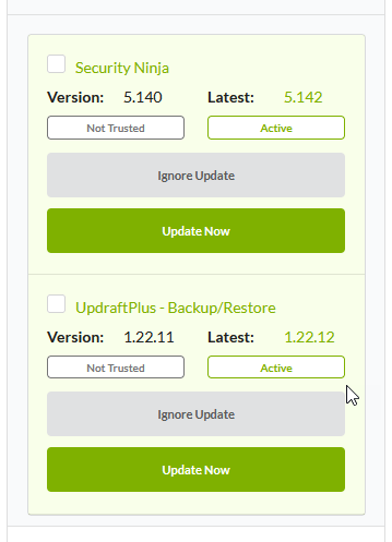
The general idea is that whenever you have 10+ updates the view with the plugin updates is getting so long that you’ll be spending time scrolling pages and pages of single line informations like labels and version numbers. Then there aren’t any visual elements to show that there are more informations about the updates, you need to figure it out that is you click on the header of an update you’ll see the sites that need to be updated. Plus, on the sites manager page you cannot even see the name of the site… and I just didn’t had the time to look further into the rest of the pages. Frankly speaking the latest 2 releases are just regressions and unusable on mobile devices, in my opinion.
I have extensive experience with UX for mobile apps and responsive websites and I’ve already offered to help of you need, but what I really want from you is to have extensive beta feedback from your clients in case you are doing an important change like this.
Thank you.