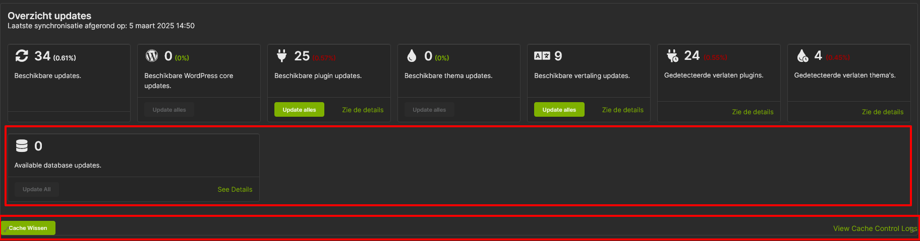
After updating MainWP Dashboard to 5.4, the overview page has a different layout. So we probably have to change it again to what we like. That’s OK, but the new overview widget seems to be incompatible with the Database Updater extension (5.0.5) and the Cache Control extension (5.0.1). So hopefully that will be fixed soon as well?
After this I saw that an update for Cache Control 5.0.2 was available. The changelog is missing, but when I try to update it “succeeds” but stays on 5.0.1 offer the same update again, so something is wrong with the version number in the update. It doesn’t solve this issue though.
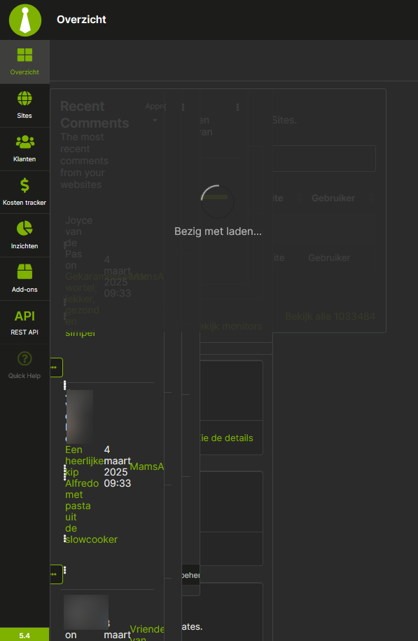
There’s also an ugly loading issue on the Overview page, because all widgets are loaded first on top of each other with random sizes before they are moved to their place.
I’ve reproduced the issue with Cache Control versioning. We will have it fixed soon.
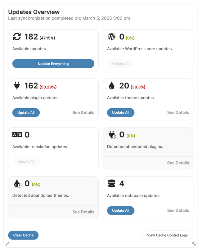
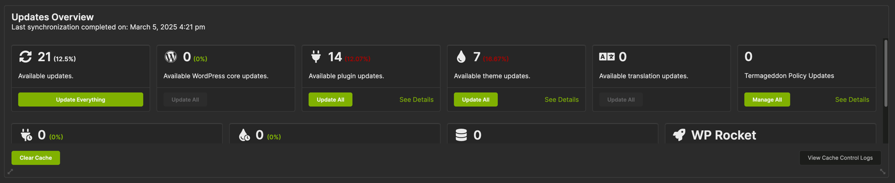
The Overview widget is indeed compatible with Database Updater and Control extension, but we will made adjustments so it looks better for all themes and all widget sizes.
I can reproduce this. However, for me this layout is visible for a fraction of a second before it renders properly.
The team will look into if this can be improved.
The fact that the Cache Control part is included in the overview widget has been causing issues for a longer time. It just doesn’t fit there.
I always had the widget like in your screenshot, but after the update it went full width. And there it doesn’t fit. I’ll move it back to its place in “portrait mode”.
Maybe it takes a fraction of a second on your dashboard but with an actual set of child sites (300+) it takes a few seconds. And it’s worse than with 5.3.x.
hey Jos, I understand your concern. We can look into setting some “placeholder/loader” element that keeps the page clean until the data is loaded and Gridster sets the widgets to positions. It should help with the UX
The main file still has the 5.0.1 version number in it. I do see that it has updated something, because the readme.txt has the correct version 5.0.2 and it also contains the changelog for the last two minor updates.
Does it only fix some padding (because I already see that) or does it bring the both buttons actually together into a sub-widget so it blends in to the overview widget?
I think that all the sub widgets should act the same and flex/float in the big box instead of being added with a different styling.
This topic was automatically closed 30 days after the last reply. New replies are no longer allowed.
WordPress® is a registered trademark of the WordPress Foundation, and WooCommerce® is a registered trademark of WooCommerce, Inc. MainWP is an independent product and is not affiliated, associated, or endorsed by the WordPress Foundation, WooCommerce, Inc., or Automattic Inc., except where noted under the Jetpack® API and Trademark License Agreement. All product names, logos, and brands are property of their respective owners and are used for identification purposes only.