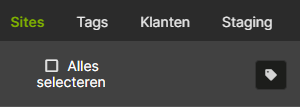
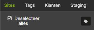
In the right sidebar on pages where sites can be selected (i.e. Manage Plugins) the select all/none checkbox has a center alignment, but that makes the box to move. This might be a bigger issue in other locales (nl_NL in my case):
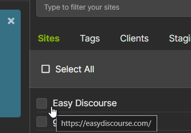
I see in the code that it’s a button, but I’m not sure if that’s the correct element for a checkbox. The button aligns center by default, while left alignment would probably be better here.